Notes from Tutsplus’s courses
Designing and Recognizing Colors
It’s wise to ensure that you understand your target and how the color affects them.
Color wheel
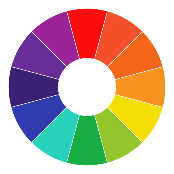
- Primary colors
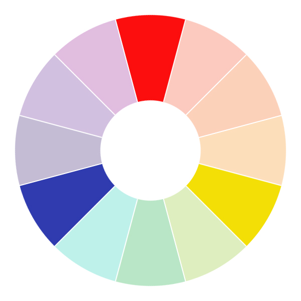
- Secondary colors
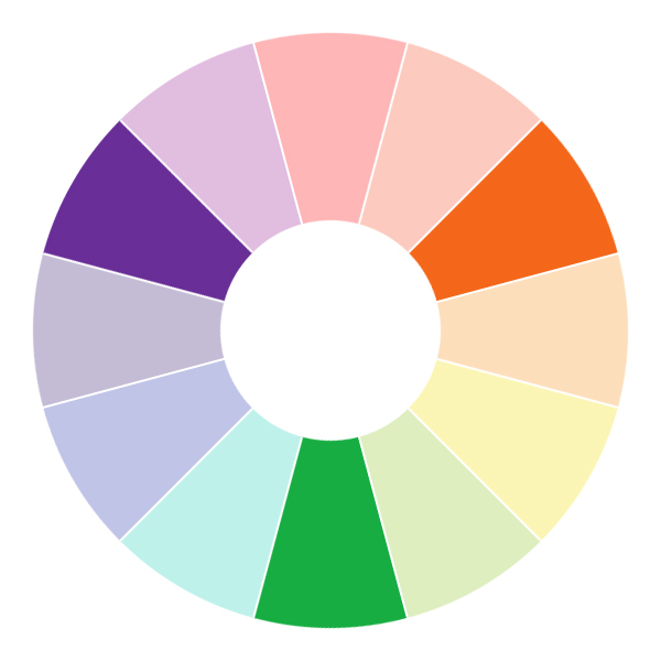
- Tertiary colors
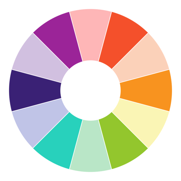
Color family
- Warm colors
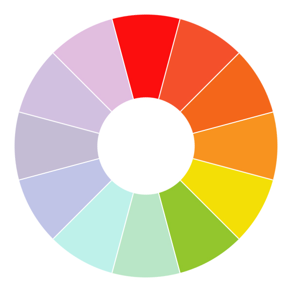
- Cool colors
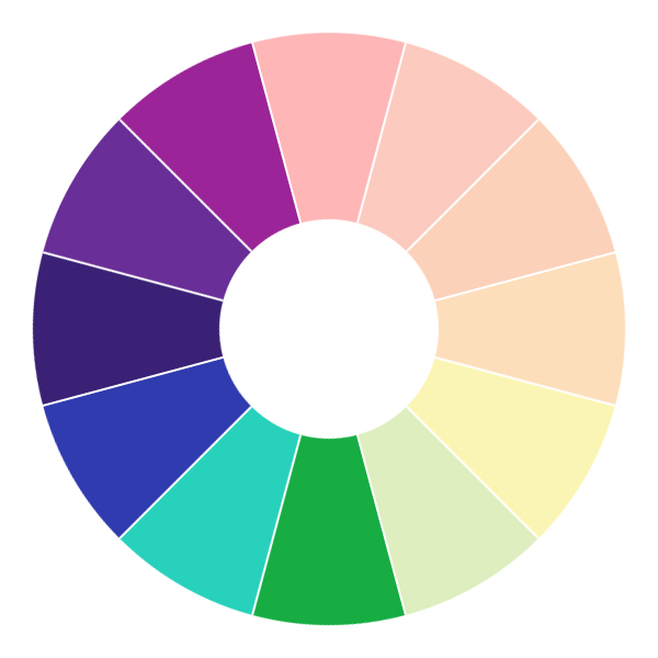
Color meanings
It’s important to understand every color has different significance depending on the people you talk wherever you are in the world.
Understanding the qualities and characteristics of color
Red
A part of the warmer color family, the primary color red is a strong, emotionally-intense color.
Some associations:
- energy
- positivity
- action
- war
- danger
- strength
- courage
- all things intense and passionate
- love, sex, passion, desire
In other cultures, red has completely different meanings. India for wedding represents purity, however South Africa for mourning.
It’s often wise to use red more as a accent color than a focal color for the whole of a website.
Orange
Belongs to warmer color family too, orange is often seen as bright, optimistic and uplifting color.
Some associations:
- enthusiasm
- happiness
- gut reactions
- spontaneity
- adventure, risk-taking
- autumn(fall) and harvest
- creativity
- citrus
- healthy food
Orange associates with autumn and the transition between seasons – so why not use orange as the transition between different areas of your design?
Yellow
The last of the main warm color. Bright, creative color.
Associations:
- creativity
- sunshine
- happiness
- energy
- cowardice
- deceit
- warnings
- instability
- clarity
- activity
Beware that too much yellow can introduce feelings of anxiety – due to it such a bright, “fast-moving” color too much yellow can lead to an unbalanced feel for your website. Instead, try to introduce other colors alongside yellow and use yellow as a highlight on a page.
Green
Part of cooler color family.
Associations:
- spring
- growth
- renewal & rebirth
- balance
- nature
- grass & gardens
- stability
- possessiveness
- jealousy
- envy
- fertility
- safety
- money
- recycling
Green offers a sense of stability and balance. Good to use in your design when you want to indicate your product or service is safe or reliable to use.
But notice green’s feeling of jealousy and envy, so be careful and ensure the balance.
Blue
The coolest of all the main colors, is often seen as a very reliable and tranquil color, mostly likely to the most association with sky and sea.
A conservative color, it is often used well in designs that represent cleanliness and and air of responsibility.
Associations:
- the sea
- the sky
- honesty
- loyally
- trust
- sincerity
- peace
- tranquility
- intelligence
Stress-reducing color that is often used in designs for masculine and corporate audiences.
Invokes feeling of trust, honesty and security so blue lends itself well in particular to the designs for products, services and companies that want to evoke that feelings in their audiences.
Not suitable for food.
Too much blue can be stifling and old-fashioned, depends on the shades used.
Violet/Purple
The last of the cooler color family, seen as quite a mysterious color, usually representing ambition, royalty and power.
Associations:
- royalty
- imagination
- power
- luxury
- wealth
- ambition
- widsom
- magic
- mystery
Combination of red and blue, intriguing and both calm and tranquil effect of blue and the energy that red offers.
Purple is often seen as luxury.
Be careful too much purple – while certain mount can promote a more majestic, luxurious feeling to your design, too much can irritate and is heard to aggravate depression in some people.
Most children prefer purple.
Using purple can also boost imagination and creativity and lighter shades of purple works well in feminine designs.